If you're searching what colors to wear engagement photos by season Cleveland, you've probably noticed our light changes hard from month to month. A mustard sweater that glows in October foliage looks muddy against April's bare trees, and a pastel that reads soft in June can vanish into a January sky. I've shot engagement sessions in every season around this city, and the outfit choice matters almost as much as the location.
Spring the tricky in-between season
Cleveland spring is not the pastel postcard people expect. From late March through May our trees are mostly bare or budding, the grass is patchy, and skies are often flat gray. Soft pastels can wash out completely against that backdrop, especially at parks like Edgewater or the Rocky River Reservation before the green really fills in.
What works instead is muted, dusty color. Think sage, dusty blue, soft terracotta, warm camel. These sit between the gray sky and the emerging green without disappearing into either. If you want true pastel pink or lavender, wait for late May when the flowering trees and green fill in enough to give you contrast.
- Best spring colors: sage green, dusty blue, camel, soft rust, warm ivory
- Avoid: pale pastel pink or baby blue before mid May, they blend into gray skies
- Fabric note: linen wrinkles fast in early spring humidity, a cotton blend holds up better for walking sessions
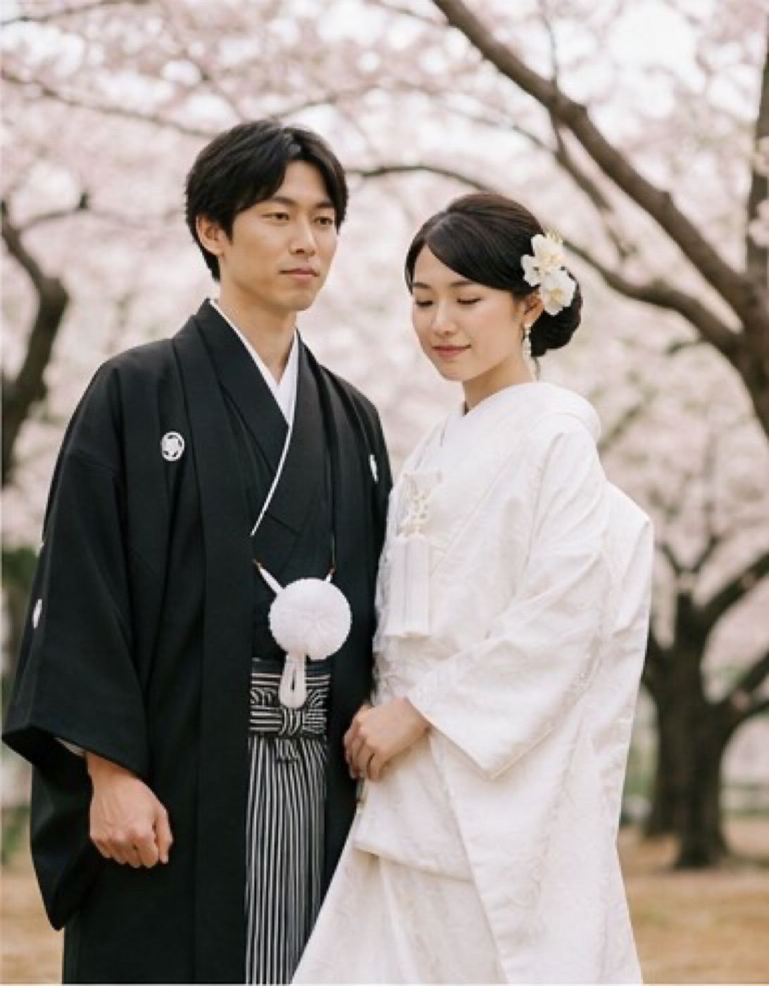
Summer go rich, not washed out
By June the Metroparks are fully green and Lake Erie is at its bluest, which means you can wear more saturated color without it fighting the background. This is the season I tell couples to be a little bold. Deep teal, terracotta, burgundy, even a rich mustard all hold their own against heavy summer greenery.
Where I see people go wrong in summer is choosing all-white outfits for both partners. Against bright midday green, white can blow out in photos and lose all its texture. If white is important to you, save it for one person and let the other wear color, or shoot during golden hour when the light is softer.
- Best summer colors: deep teal, terracotta, burgundy, olive, warm mustard
- Avoid: matching all-white outfits in harsh midday sun
Fall Cleveland's best photo season, and the easiest to get wrong
Fall is when I get the most outfit questions, because everyone wants to match the foliage without competing with it. Cuyahoga Valley and the vineyard properties around here turn orange, red, and gold fast, usually peaking in mid to late October. If your outfit is also orange or red, you'll blend into the trees instead of standing out.
Jewel tones are your friend in fall. Emerald, navy, deep plum, and burgundy all read as rich and intentional against orange and gold leaves without matching them exactly. I shot a couple last October at Gervasi Vineyard in deep emerald and burgundy and the contrast against the turning vines was exactly the kind of thing that makes a photo feel timeless instead of trendy.
- Best fall colors: emerald, navy, plum, burgundy, mustard used sparingly as an accent
- Avoid: orange or rust tones that match the leaves too closely and flatten the image
- Fabric note: a lightweight wool or suiting fabric photographs better than knit sweaters, which can look bulky in wide shots
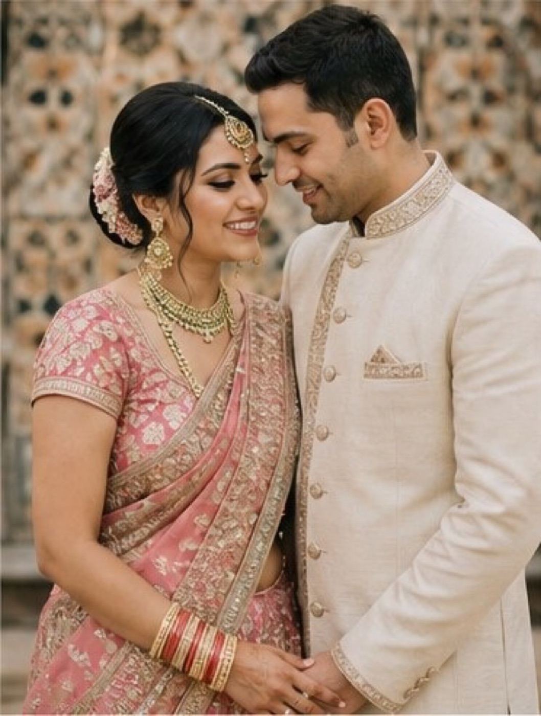
Winter the season people underestimate
Winter around Cleveland means gray skies, lake effect snow, and bare trees, and a lot of couples assume there's nothing to photograph well in it. I disagree. Winter light is soft and even, and it's actually one of the most forgiving seasons for skin tones. The trick is color choice against snow and gray concrete.
Cream and white outfits are beautiful in person but they can flatten into a snowy background in photos, losing all separation. Deep, saturated color is what pops. I've shot sessions at The 100th Bomb Group where deep burgundy coats against the industrial hangar backdrop gave the whole set a warmth that a neutral palette just would not have.
- Best winter colors: deep burgundy, forest green, charcoal, navy, black
- Avoid: all white or cream, it can blend into snow and gray skies with no contrast
Fabric matters as much as color
Cleveland weather does not stay put, so fabric choice needs to match the actual conditions on your date, not just the season on paper. Linen breathes well in summer humidity but wrinkles within twenty minutes outdoors. Wool suiting holds its shape in wind, which matters a lot near the lake. Silk and satin catch light beautifully but can show sweat in July and stiffen up in cold.
The color gets people's attention first, but it's the fabric that decides how the photo actually feels.
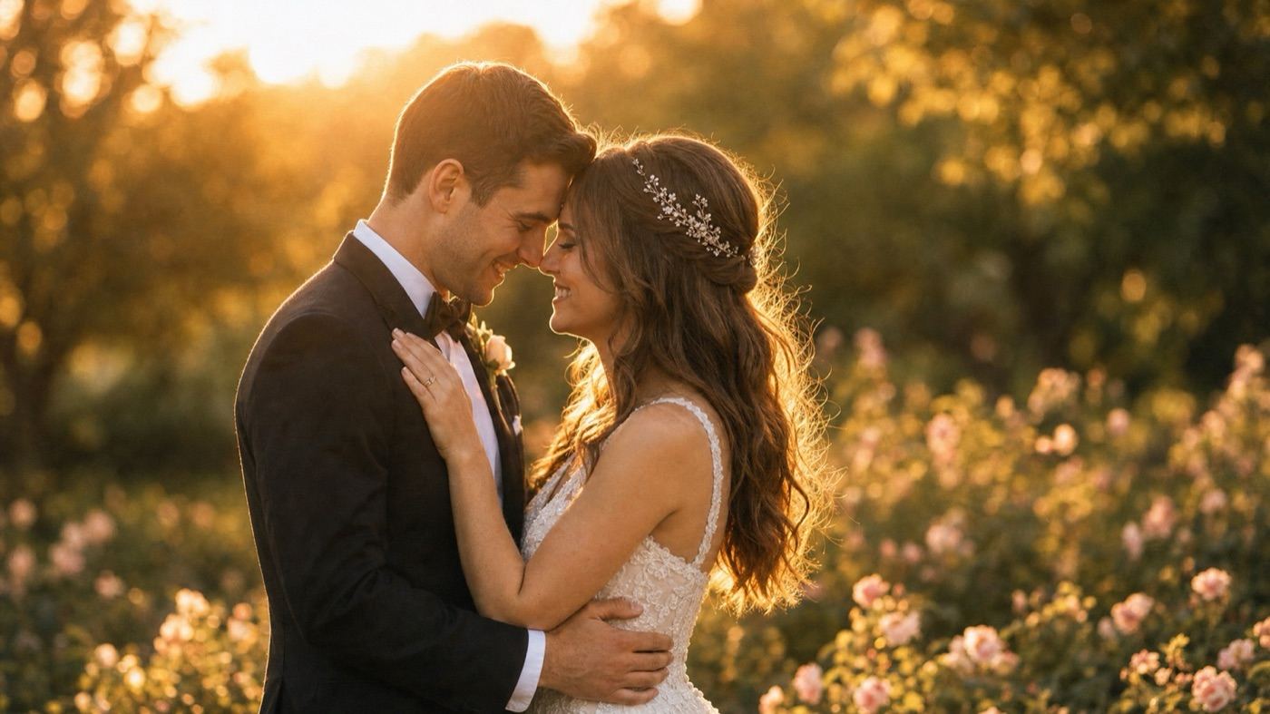
Matching your outfits without looking matchy
You don't need to wear the exact same color as your partner. What actually works in photos is choosing colors from the same family or tone, so one person might wear a solid deep green while the other wears a patterned shirt with green as an accent. This reads as coordinated without looking like a costume, and it holds up better across the different backdrops we might hit during a single session, whether that's a park, a vineyard, or a downtown street.
- Pick one anchor color and let each person interpret it differently
- Save patterns for one person only, keep the other solid
- Bring a backup layer, Cleveland weather changes fast enough that you'll want it
Planning around your venue and your actual date
Outfit color should always get checked against your actual location before the day, not just the season in general. A vineyard in October photographs differently than a lakefront park in October, and a downtown industrial space photographs differently than either. If you're not sure how your palette will read against your specific spot, it's worth a quick conversation before the session. I cover a lot of this thinking for full weddings on the weddings page, and pricing details live on the investment page if you're building out your whole day around it.
Details are general and drawn from public information as of 2026. Confirm current specifics with the venue directly.