After several seasons photographing weddings around Northeast Ohio, I've learned that wedding party outfit colors for photos matter more than most couples realize. The right palette can make your gallery feel timeless. The wrong one can fight the venue, wash out skin tones, or clash with the light you have in October versus June. Here's what actually works, from someone who's stood behind the camera at barns, lodges, and downtown ballrooms.
Why Color Choice Matters More Than You Think
Color reflects light onto skin, and skin picks up whatever is closest to it. I've watched a bridesmaid in bright coral end up with a warm orange glow on her collarbones in every close up shot, because that's just how light bounces. It's not a mistake, it's physics. Once you understand that, choosing wedding party outfit colors for photos gets a lot easier.
I also think about how colors sit against Cleveland's specific backdrops. Downtown brick, lakefront gray skies, autumn foliage in the Metroparks. A palette that looks great on Pinterest doesn't always hold up against our actual light and architecture.
Colors That Work Against Cleveland's Greenery and Brick
Northeast Ohio venues tend to lean into natural materials, wood beams, stone, open fields, string lights. Colors that echo those tones almost always photograph better than colors that fight them. When I shoot at The Barn at Mapleside Farms, the sage greens, warm terracottas, and soft ambers in a wedding party pull the whole frame together instead of competing with the barn wood and orchard views.
The same logic applies at Happy Days Lodge, where the stone fireplace and timber ceiling already carry a lot of warmth. Cooler jewel tones like deep teal or plum hold their own there without looking cold or out of place.
- Sage, olive, and moss green for wood and orchard settings
- Terracotta, rust, and amber for fall ceremonies
- Dusty blue or slate for lakefront or industrial venues
- Deep burgundy or plum for lodge and cabin settings with fireplaces
Groomsmen Suits That Hold Up in Every Season
Groomsmen suits get less attention than dresses, but they carry just as much visual weight in a photo. Navy is close to a universal winner in Cleveland because it reads richly indoors under lodge lighting and stays crisp outdoors under open sky. Charcoal works nearly as well and photographs a shade darker and more formal.
For outdoor barn weddings in warmer months, a lighter tan or heathered gray suit photographs beautifully against green fields without looking washed out, but confirm with your venue how much shade or open sun the ceremony spot actually gets before you commit, since that changes how heat and color show up on camera.
- Navy: works almost everywhere, indoors and out
- Charcoal: reads formal, photographs well in low light
- Tan or heathered gray: best for daytime outdoor barn ceremonies
- Avoid pure black for outdoor summer weddings, it absorbs heat and light unevenly in photos
Mismatched Dresses Done Right, Not Chaotic
Mismatched bridesmaid dresses can look effortless or messy, and the difference usually comes down to discipline, not creativity. I tell brides to pick one color family and let each dress vary in shade, or pick one fabric and let the silhouettes vary, but never let both change at once.
- Stick to one color family across all dresses, vary only the shade
- Or keep the same fabric and let silhouettes differ instead
- Avoid mixing satin and matte fabrics in the same lineup, they catch light differently side by side
- Ask each bridesmaid to send a fabric swatch photo before ordering so you can compare tones together
Fabric and Fit The Detail Nobody Warns You About
Fabric matters as much as color. Heavy satin looks elegant standing still but can throw hot, distracting light back at the camera during a first look or a windy outdoor portrait. Matte crepe and chiffon move more naturally and photograph softer in direct sun.
Fit matters too. A suit that's slightly too big photographs sloppy in every group shot, even if it feels fine standing at the altar. Get groomsmen suits tailored, even minimally, it's one of the cheapest ways to make a wedding party photograph like it belongs in a magazine instead of a rental catalog.
A Few Colors I'd Think Twice About
A few color choices tend to cause more trouble than they're worth once the camera comes out. Neon shades photograph as a color cast on nearby skin. All white bridesmaid dresses compete visually with the bride and confuse the eye in group shots. Busy patterns or sequins in large groups create a flickering, distracting texture in wide photos, even though they look fun in person.
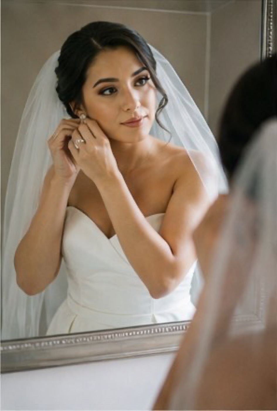
The best wedding party colors don't compete with the bride, they frame her.
- Neon or highly saturated colors, they cast onto nearby skin
- All white or ivory bridesmaid dresses, too close to the bride's dress
- Heavy sequins or metallics in large groups, they flicker and overexpose in photos
- Busy florals or patterns repeated across many bodies, reads chaotic in wide shots
Putting It Together For Your Cleveland Wedding Day
Every couple's day is different, and the right palette depends on your venue, your season, and honestly, your personal taste, so treat all of this as a starting point rather than a rulebook. If you're still deciding on a venue or season, browse how I approach different weddings around Cleveland to get a feel for how color and light play out in real galleries, not just styled shoots.
If you want to talk through your specific colors, season, or venue before you order anything, reach out through contact and I'm happy to look at swatches with you. You can also check investment details to see how this fits into your overall wedding photography plan.
Details are general and drawn from public information as of 2026. Confirm current specifics with the venue directly.